New York Augmented Reality Meetup presentation

I did a presentation on ‘Before Ubiquity’ to the New York AR Meetup in November. It went rather well and I hope you like it. Andrew Agus, who’s been keeping the AR flame burning on the east coast for many years — read the original blog post and thought it could be repackaged as a talk – he was right!

The New York Augmented Reality group is one of the OG’s of AR. Among many notable meetings, fireworks flew in the April 11, 2022 “Great Display Debate” between Jeri Ellsworth and Karl Guttag. You’ll come away knowing a lot more about AR and VR after watching it.

https://www.youtube.com/watch?v=NeECmKWjwqg&t=4s

Why you should watch “2047: Virtual Revolution”

In the wake of Apple’s successes over the past decade, agencies and technical schools like the Savannah College of Art and Design have been pumping out web designers and a career ecosystem that supports them as well as a particularly disciplined, minimalist, flat aesthetic that can be traced back to Steve Jobs. One of the peculiarities of the rise of 3D games and VR/AR/MR/XR platforms is that these children of the Jobs revolution have little interest in working with depth. The standards of excellence in the web-based design world — much less the print-based design world it grew out of – are too different. To work in 3D feels too much like slumming.

br

But design is still king in 3D as well as on the web. When the graduates of SCAD and similar schools did not embrace 3D design, film FX designers like Ash Thorp and Greg Borenstein jumped into the space the left vacant. For a period after the release of Steven Spielberg’s Minority Report in 2002, there was a competition among FX artists to try to outdo the UIs that were created for that film. From about 2010, however, that competitive trend has mellowed out and the goal of fantasy UX in sci-fi has changed into one of working out the ergonomics of near-future tech in a way that makes it feel natural instead of theatrical. By carefully watching the development of CGI artifacts in the 21st century – as an archeologist might sift through pottery shards from the ancient past –, we can see the development of a consensus around what the future is supposed to look like. Think of it as a pragmatic futurism.

co

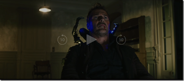
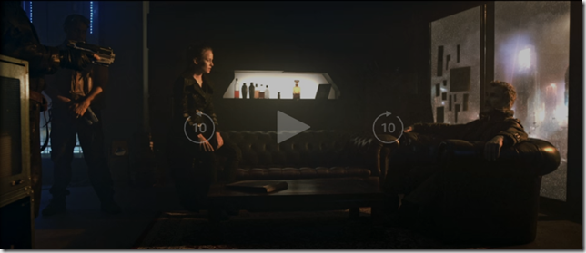
The 2016 French film 2047: Virtual Revolution, written and directed by Guy-Roger Duvert and staring Mike Dopud, is a great moment in the development of cinematic language in the way it takes for granted certain sci-fi visual cliches. Even more interesting is what appears to be a relatively low-budget film is able to pull off the CGI it does, indicating a general drop in price for these effects. What used to be hard and expensive is now within reach and part of the movie making vernacular.

quit

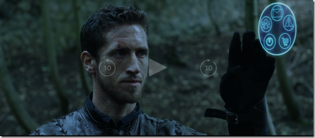
The story is about a future society that spends all its time playing online RPGs while the corporations that run these games have taken over the remnant of the world left behind. But what I found interesting was the radial interface used by players inside their RPGs.

mlui

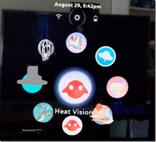
It bears a passing similarity to the magic leap OS navigation menu.

mech

It also gives a nod to popular gaming genres like Gandam battle suits …

cd

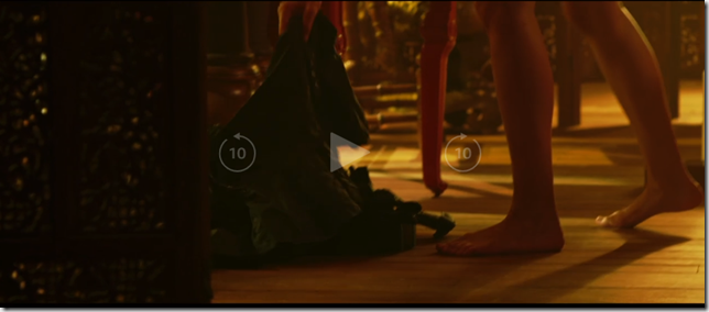
Fantasy UX (FUX) from films like Blade Runner and The Matrix …

wow

And World of Warcraft.

Play the movie in the background while you are working if you don’t have time to get into the plot about a dystopic future in which people are willingly enslaved to VR … blah, blah, blah. But look up from time to time in order to see how the FX designers who will one day shape our futures are playing with the grammar of the VR\AR\MR\XR visual language.

The effects for 2047 appear to have been done by an FX and VR company in France called Backlight. The movie is currently free to Amazon Prime members.

For some more innovative FUX work, please take a look at 2013’s Ender’s Game or the Minority Report tv series from 2015.

Metro Slide Deck

Thanks to everyone who came out to the Windows Phone Garage / Mobile Hackathon for Social Good at the WebVisions conference in Atlanta and showing your solidarity with the Occupy Wall Street movement.  And thanks to Macquarium for hosting the Thursday sessions.

I’ve uploaded the slide deck for my talk on the Metro Aesthetic. 

I also wanted to mention, for those who missed it, that I was interviewed last month by Steven Cherry about the Windows 8 Tablet Story in a podcast  for IEEE Spectrum (which he titled “Microsoft’s Polygamous Windows 8”): http://spectrum.ieee.org/podcast/geek-life/tools-toys/microsofts-polygamous-windows-8  It was a lot of fun to do and I was impressed with how adroitly Steven was able to edit out my long pauses and “ums” and “uhs” when I didn’t know what to say. 

No Phone App Left Behind on Win8: A Proposal

winrt

As the Windows 8 tablet comes closer to reality, its success will depend on the amount of content it can provide out of the gate.  The Windows Phone Marketplace has tens of thousands of apps that should be leveraged to provide this content.  The main barrier to this is that the development stacks for Windows Phone and Windows 8 are significantly different.  A simple solution to bridge this gap is to enable Metro Tiles for Silverlight apps running in “classic” mode – something not currently easy to do on the Windows 8 platform.  Here is the background.

There has recently been a revival of chatter about the death of Silverlight revolving around the notion that Silverlight 5 will be the last version of the platform we are likely to see: http://www.zdnet.com/blog/microsoft/will-there-be-a-silverlight-6-and-does-it-matter/11180?tag=search-results-rivers;item2

At the same time, Hal Berenson has lain out an argument for moving the WinNT kernel (MinWin?) into Windows Phone 8, a suggestion backed up by Mary Jo Foley’s reporting that there is a Project Apollo to do something like this. 

The main argument against the claims that Silverlight is dead concern the fact that it is currently still at the heart of Windows Phone development.  If MinWin from the Windows 8 OS for tablets replaces the WinCE kernel on Windows Phones, however, what will be the fate of Silverlight then?

The 40,000 App Bulwark

The most important piece in this complex chess game Microsoft is playing with its various technology platforms — old, new and newer (remember when Silverlight was still bleeding edge just a few months ago?) – is neither at the kernel level nor at the API level nor even at the framework level.  The most important piece is the the app marketplace Microsoft successfully built around the Windows Phone.  In a game in which almost any move seems possible, those apps must be protected at all cost.  30,000 apps, most of them built using Silverlight, cannot be thrown away.

At the same time, Windows Phone is a side-game for Microsoft.  In order to succeed in the smart phone market, Microsoft merely has to place.  The number three spot allows Microsoft to keep playing.

The main event, of course, is the tablet market.  Windows Phone can even be considered just a practice run for the arena where Microsoft really sees its future at stake.  The tablet market is make or break for Microsoft and its flagship product – its cash cow – Windows.

Fragmenting the app market into Silverlight on Windows Phone and WinRT’s three development platforms on Windows 8 seems nothing short of disastrous.  Microsoft needs those 40,000 apps as they launch their new tablet platform.  Without apps, all the innovations that are going into Windows 8 are practically meaningless.

My colleague at Razorfish, Wells Caughey, has recently written about his efforts to create live tiles for “classic” apps on the Windows 8 Developer Preview: http://emergingexperiences.com/2011/11/leveraging-the-windows-8-start-screen/ .  It’s hacky but works and allows several dozen of our apps written in WPF, Silverlight and even Flash to run inside the Metro environment on Win8.

What we learned from the exercise is that Microsoft has the ability to allow live tiles for classic apps if it wants to.  It currently does this for the classic windows desktop which runs as an app from the Metro desktop. 

Were Microsoft to do this, they could easily gain 40,000 apps at the Windows 8 launch.  Silverlight for Phone apps are relatively easy to turn into regular Silverlight apps.  It could be made even easier. 

On top of that, developers already know how to write Metro style apps using WPF, Silverlight and other tools.  Even since the introduction of true multitouch capability in WPF 4 and multitouch controls for Silverlight WP7 development, this is what we have all been working on.

For the moment, however, Microsoft is still apparently pushing for people to learn their new development tools in order to program for Windows 8 Metro and Windows Phone developers are being advised to learn WinJS and the currently somewhat anemic WinRT Xaml platform in order to port their apps.

This is all well and good but why does Microsoft want to leave its greatest asset in the tablet market – its 40K phone apps – on the sideline when enabling live tiles for these apps immediately puts them back in the game?

[note: Microsoft just broke the 40K milestone, so references to “the 30K app bulwark” have been edited to reflect this.]


Why ReMIX?

Logo-72dpi-Color

On August 6th, the Atlanta developer community will be hosting ReMIX South, a conference for designers and developers.  This is the second year the conference has been held in Atlanta.  Early Bird tickets can be purchased at http://remixsouth.eventbrite.com .  The official website is at www.remixsouth.com .  Tickets are only $30 through June 28th.

There are lots of great conferences throughout the year such as MIX, An Event Apart and TechEd.  These all tend to be extremely expensive, however.  At the other end of the spectrum are community events such as MadExpo, CodeStock, the various code camps and DevLink.  These are great, inexpensive grassroots level events.  Anyone can speak and the agendas tend to be more or less random.

ReMIX is an attempt to create something in between these two extremes.  We created an event that has the level of speakers you would typically see at all the former two to three thousand dollar events but at the price of a community event.

We do this by spending much of our time throughout the year at all of these other conferences trying to recruit speakers for ReMIX South.  We spend half the year discussing who is a top speaker, who is a rising speaker, and what topics have become important in 2011.  In other words, we spend the majority of our effort simply planning out our speakers the way a painter mixes colors or a chef blends flavors.

We do this in order to provide what is, to our minds, a unique and satisfying experience for our attendees.  Of all the speakers we reached out to, only two of our must haves couldn’t make it: Bill Buxton and Robby Ingebretsen – both had prior engagements.

We keep prices low through very generous sponsorship as well as being very frugal with your money – though controversial, we don’t provide lunch or t-shirts.  While these are standard for most conferences, we found that we can cut the price in half simply by leaving them out.  We also keep your bottom line low by choosing a central location, The Marriott at Perimeter Center, which has free parking.

(As an aside, when I was at An Event Apart, I paid the same amount for my parking as the price of one early bird ticket to ReMIX: $30.)

The other thing we try to do at ReMIX is to provide a designer event that is friendly toward developers, as well as a developer event that is friendly toward designers.

It is also an event that we try to make welcoming for both Microsoft stack as well as non-Microsoft stack developers.  We understand that, depending on where you come from, our agenda will always seem to lean too much in one direction or the other.  To our thinking, this is a good thing.  We want to bring the different communities together. 

Non-Microsoft developers will get a bit of exposure to a world they tend to stay away from, while Microsoft stack developers will have their minds expanded to a world they are not familiar with.  At the end of the day, we all leave knowing a little more about our craft than we did when we came and have a broader understanding of what our craft entails.  Everyone moves out of their comfort zone and becomes stronger for it.

And if you don’t want to have your mind expanded, that’s cool, too.  We have enough sessions to keep anyone inside their comfort zone, if that’s what they want.

Here is what we are offering this year:

The Keynote

Albert Shum is one of the most fascinating people currently working at Microsoft.  He is part of the revolution within Microsoft that transformed their mobile strategy and placed, for once, design at the center of a new technology offering.  Albert led the design team that created the much discussed “Metro” language used originally on Windows Phone and now, according to well-placed rumors, on the Surface 2 and Windows 8.  If you are still confused about what “Metro” actually is, this is your best opportunity to find out – he’ll be at the conference all day and is very approachable.

The Web Track

This is the track we are perhaps proudest of.  If you are a Microsoft stack developer, then you might think of HTML5 as a zombie-like infestation that is taking over and displacing all the technologies you are used to working with.

On the other hand, if you aren’t part of the Microsoft world, you probably are perplexed when people make a big deal about HTML5 and wonder if they are talking about CSS3 + JQuery. 

So what we are offering in the Web track at ReMIX is a bunch of non-Microsoft stack web developers explaining HTML5 to both Microsoft and non-Microsoft developers.  Brilliant, right?

J. Cornelius of CoffeeCup Software will start by presenting “HTML5: Yes Really.”  The title is a joke and if you don’t get it, then you really need to attend.   He will provide the opening overview of HTML5

John Agan, who builds amazing web experiences for Epic Labs, will teach us about JQuery

Josh Netherton of MailChimp will school us on CSS3 in “More Than Just Rounded Corners.” 

Finally, we’ve invited August de los Reyes of Artefact to speak.  If you aren’t familiar with August, he happens to have given the most impressive talk at MIX11 this year – and it was only ten minutes long!You can find a video of his MIX presentation here .  At ReMIX South, August will be presenting an expanded version of his talk 21st Century Design.

Mobile \ Tablet Track

The past year has been spent pursuing the code-once dream for mobile development using tools like Mono, PhoneGap, the Adaptive Web and, most recently, HTML5.  If you’ve been following the trends in iPhone, Android and Windows Phone, you’ll know that this has been a rocky and occasionally treacherous path.  Not only do the different tools not always work … ahem … perfectly, but the rise of tablets is also making it clear that designing and developing for non-desktop computers is a lot more complex than just working with different form-factors.  We’ve invited several Microsoft as well as non-Microsoft stack people to walk us through the variegated world of mobile and tablet development.

Douglas Knudson, Technical Architect for Universal Mind and organizer of the Atlanta Flex User Group, will show us how to use Adobe Air to target multiple mobile and tablet platforms.

Luke Hamilton, Creative Director at Razorfish, will speak on “The Interface Revolution” and cover how to work with all the new devices we are being confronted with as technology keeps progressing.

Shawn Wildermuth, a well known trainer and expert in Windows Phone development, will walk us through the new features being introduced in Windows Phone Mango.

Jeremy Likness will talk about his experience working with Silverlight for tablets.  He will also discuss what we currently know about Windows 8, which is being promoted as a tablet platform that uses both HTML5 as well as a XAML-based language for development.

Rob Cameron, who was also with us last year, is a Microsoft Architect Evangelist.  He will talk, among other things, about developing games for Windows Phone using XNA.

Windows Phone Garage

No pretense of non-Microsoft material here.  Starting in mid- to late-August, the Windows Phone Marketplace will start accepting Mango apps.  This full day dev garage will get you ready for that.  Just bring a laptop and we’ll take care of the rest – by the end of the day you will have an application ready to start making you money. 

mixheadshot_reasonably_small

Unlike other phone garages, this one will be surrounded by top talent in development and design as well as several Windows Phone development MVPs.  If you would like their help, we’ll setup a sign-up sheet so you can arrange to get one-on-one advice about your app.

UX Track

The UX Track has always made the ReMIX conference stand apart from other conference.  This is really the place where we invite speakers to talk broadly about a variety of topics which we place, loosely, under the UX rubric.

Let me point out, first of all, that all of our speakers are amazing.  These are our rock stars. Rick Barraza has become an institution helping developers understand UX and design as well as trying to help devs and designers to work together.  He spoke at MIX this year.  Jenn Downs is simply cool and MailChimp, her company, is widely lauded for breaking new ground in connecting with customers by being hip, playful, cheeky and, of course, extremely useful.  MailChimp has pretty much been invited to speak at every major conference this year.  Zach Pousman and James Chittenden were both extremely popular speakers at last year’s ReMIX.  Zach is an expert in both academic and practical UX, while James is a UX Architect for Microsoft Consulting – you probably didn’t even know there was such a thing.  We are very lucky to have them back.  Designers think Matthias Shapiro is a designer while developers assume he is a developer since he has been so effective in bridging both worlds.  His talk on Motion is a must see.

If you have spent your careers as developers and have never been exposed to the world of UX and design, then the best favor I can do for you is to recommend that you spend your whole Saturday in this track.  You’ll thank me for it.  Really, you will.

Kinect Track

This is very exciting for us.  The Kinect Track is our opportunity to take a new technology, bring together some of the leading experts on developing for the Kinect and hold the first conference event about the Kinect.  Other conferences are beginning to have one or two Kinect talks a piece, if they have any.  At ReMIX, we provide a full day of Kinect content.

All of our Kinect speakers come for the most part from the pages of the KinectHacks website. 

Jarrett Webb is the creator of KinectShop, an application that has given us the best picture so far of how the Kinect and related technologies will one day be used in retail.  He is generously providing the introductory talk on developing for the Kinect.

Zahoor Zafrulla is a Phd candidate at Georgia Tech.  He is making breakthroughs in using the Kinect sensor for education.  His particular interest is in using the Kinect to teach American Sign Language.

Steve Dawson and Alex Nichols wrote the DaVinci Kinect application in November of 2010 – shortly after drivers for building Kinect applications for the PC became available.  It was one of the first apps recognized for successfully pulling off  ‘The Minority Report’ effect and Microsoft later asked them to present it at the E3 conference to demonstrate what Kinect hacking is all about.

Josh Blake is the best known figure in the Kinect world.  Besides being widely recognized as an authority on Natural User Interface concepts, he is also the founder of the OpenKinect community.  There are few people who know more about the growth and future potential of the Kinect technology than Josh.

The final Kinect session of the day will be a panel discussion moderated by Josh Blake with panelists Albert Shum, Rick Barraza, Luke Hamilton and Zahoor Zafrulla.  They will be discussing the influence of TV shows and movies on how we envision the future of technology as well as what the future of technology will actually look like.

Telerik ToDoLists reference application

todolists

Telerik has published a ToDoLists reference application on their site to demonstrate how to use their Windows Phone Rad controls as well as to walk developers through their process for designing a WP7 application.  Telerik asked me to write a few words about it.

If you have already been through Microsoft’s default templates, this reference app is a good next stop.  You can read about it and download the sample code here: http://www.telerik.com/products/windows-phone/getting-started/todolists.aspx

For all we learn from blog posts and books, there’s nothing quite like walking through a sample app to learn how to do something.  There are several non-standard but – I think – extremely interesting things about this app that developers will find useful.

1. Telerik discusses their design process and includes a wireframe document for download.  Many of us have no idea about how to go about designing a Windows Phone application.  This little bit of guidance on the design process (definitely UI design first) is probably one of the most valuable things available to WP7 developers currently on the internet.

2.  The ToDoLists app does not try to inherit the user defined accent colors or background theme.  There is one look and it is the one the designer came up with.  This may seem unorthodox at best and heretical at worst.  To me, however, it seems like a brilliant move.  The whole point of the limited customization of themes is to give the end-user a sense of control and personal connection with their apps.  The cost of trying to incorporate the user selected theme, however, is a compromise of the design vision.  If the design is good, I think it is worthwhile to simply ignore the user theme and maintain the integrity of the design as is done in this reference app. 

3. The ToDoLists app also demonstrates how to organize the design vision in code and how to organize resources.  This is a topic that usually gets short-shrift.

4. The ToDoLists app uses my friend Jeremy Likness’s Sterling NoSql database.  This is extremely handy code to be able to walk through.  The app even provides an example of generating initial data for Sterling.

5. It doesn’t use any of the standard MVVM frameworks.  Instead, it’s a roll-your-own implementation of MVVM.  This is a nice reminder that MVVM doesn’t have to be complex.  We’ve almost reached the point when we no longer have to explain why MVVM should be used in XAML-based applications.  It’s simply what we do, right?

6. This is an attractive design.  It is recognizably Metro without slavishly following what most developers interpret as the Metro guidelines – that is, black, white and blocky.

So is this a paid ad for Telerik?  Sort of – except to turn things on their heads, you get paid instead of me.  If you are one of the first ten commenters on this post, and include a valid email, and are not a bot (so many conditions), Telerik will send you a free license to their RadControls for Windows Phone

Just be one of the first ten commenters to say something like “I’d like a free license” in the comments by EOD next Monday (the 16th) and Telerik will hook you up.

Delight

When the Windows Phone 7 ad campaign started airing, I unfortunately  misunderstood the message.  I thought the point of the campaign was that Microsoft was coming out with a new device that would captivate consumers so thoroughly they would abandon their quotidian activities to use it.  I was also moved by Microsoft’s apparently willingness to make fun of themselves about how good their product would be – a product so wonderful it would stop traffic and so sexy it would pull men away from their lovers.

The final voice over, however, thoroughly confused me.  “A phone to save us from our phones.” 

It actually took me a few weeks before I realized that Microsoft was making a completely different kind of play.  They were claiming to understand smartphones while their competitors, Google and Apple, did not.  Smartphones, it turns out, aren’t supposed to enchant, bind and compel.  They are, according to Microsoft marketing, primarily functional devices intended as content delivery systems.  They are, in effect, the hardware equivalent of Sharepoint.

For me this is a problem with Microsoft messaging and not with Windows Phone itself.  These are delightful commercials that spread an insidious and misguided philosophy emphasizing functionality over experience. 

But isn’t that the Microsoft philosophy that was supposed to have died when Windows Mobile was replaced with Windows Phone? Windows Mobile was an expensive tool.  Windows Phone is an expensive toy.  And the most successful smartphone toy is the one that a room full of children want to pick up and play with because it enchants them, it binds them, it delights them.

I don’t claim to fully understand the experience of delight but I have a strong instinct that Microsoft marketing does not appreciate it despite the lengths to which they go to talk about it. 

Delight, for me, is not about utility but rather concerns itself with superfluity.  And while there is a current trend against “distraction” in the UX world, something delightful should at least make us tarry.  Even better it should make us wonder.  It should have a minimum of functionality but a vast degree of intricacy.  It should emphasize this with depth rather than magnitude – that is, it should be small and rich rather than provide a long feature list of things it can do.

Most of all, something delightful shouldn’t have to be explained.  This is, nevertheless, what I will attempt to do in this post – to explain what delight is. 

I will do this, however inadequately, by culling examples from various arts: food, film, poetry, and tactile art.  I won’t try to tie any of this directly to the design of smartphone devices or the development of smartphone apps, but all the same expect that these analogies will be apparent to the reader.

My main thesis is that there are four important elements to delight: superfluity, delicateness, enchantment and intricacy.  These are all, moreover, elements completely within the grasp of the Windows Phone developer and which the Windows Phone Metro style will support, if used correctly.

It might be more straightforward to say, however, that these are some of the things that delight me and I’d like to share them with you.


Superfluity

Something which delights is received as a gift.  It is given freely and nothing is expected in return for it.  It also has no purpose other than itself.  The scent of a flower does not delight because the smell is useful to us or because it enables us to smell.  The delightful thing does not enable anything.  It is purposeless. 

Even Aristotle, as practical as any philosopher can be, said of the origins of the useless arts,

“… as more arts were invented, and some were directed to the necessities of life, others to recreation, the inventors of the latter were naturally always regarded as wiser than the inventors of the former, because their branches of knowledge did not aim at utility.”

Useful things always serve another purpose.  Useless things are an end in themselves and are just for us.  This sense of our own specialness is essential to the experience of delight.


Delicacy

In finer restaurants around the world, there is a course known as the amuse bouche.  It is typically a one-mouthful dish selected by the chef and delivered to his guests.  It also will typically not ever appear on the bill.  It is a gift intended simply to “delight-the-mouth” as well as the mind.

amusebouche1

Presentation is always impeccable.  The game for the chef is to pack as much visual and flavorful complexity as he can into a small package.

Salmon-Amuse-Bouche_6

One of the finest I’ve ever had was a fresh oyster in a half-shell with a tiny square of green, absinthe jello placed on top.

amuse2

The miniature size is essential to the effect not only because it establishes a rule within which the chef must operate (only a single mouthful of food) but also because of the inherent delight we experience when we encounter the small.  Large meals make us full.  Large pieces of art evoke a sense of the sublime.  Large works of poetry stay with us and cannot be shaken.  The amuse bouche, on the other hand, simply leaves behind a sense of happiness and gratitude.


Enchantment

Enchantment has become an overused word, as have all the synonyms we might use in its place: magic, uncanny-ness, wonderment.  The purpose of enchantment is to lift us out of our own sense of being.  For just a moment time stops, goals are put aside, and we are allowed to simply be.  The delightful object puts the real world aside and provides a space for us to rest from it.

This notion of enchantment was at the heart of the 19th century Romantic movement in poetry.  In his preface to the Lyrical Ballads, Wordsworth wrote of the new poetry he and Coleridge were devising,

“The principal object, then, proposed in these Poems was to choose incidents and situations from common life, and to relate or describe them, throughout, as far as was possible in a selection of language really used by men, and, at the same time, to throw over them a certain colouring of imagination, whereby ordinary things should be presented to the mind in an unusual aspect.”

One of my favorite film-makers, Jean Cocteau, was himself a poet and novelist who – almost uniquely – brought this unique sensibility to his movies.  The techniques of visual poetry he improvised have over time become part of the common idiom of filmmaking.  No one, however, has ever quite been able to replicate the sense of the uncanny he created in films such as La belle et la bête or Orphée.

Watch, for instance, the arrival of Belle to the Beast’s castle. 

The techniques are simple – people with their arms poked through a wall, slow motion filming, and a rolling palette upon which Josette Day is pulled forward.  By pulling all these effects together, however, Cocteau was able to create something light and otherworldly.

Here is another effect Cocteau originally attempted in his film from the 30’s Le Sang d’un Poete but didn’t get right until Orphée.  It is an adult play on Lewis Carroll’s Through the Looking Glass.  My favorite line: “It is not about understanding.  It’s about believing.”


Intricacy

A key notion in UX is discoverability.  Something should always be left to the end-user to discover on their own.  Discovery is a way for users of an experience to make the experience their own.  They form an emotional connection with devices and experiences that are discoverable and achieve a sense that the object of delight is for them because they are the ones who figured it out.

Dan Ohlmann is an artist whose works are exhibited at the Musée des miniatures et des décors de cinéma in Lyons. 

IMG_32321

His talent is not just in mastering the art of the small, but in perfecting the attention to detail needed to enchant his audience and keep them riveted to one spot.

lyon-miniatures-library

1242746618

I feel like I could step into one of these dioramas at any time and will find a full world in miniature simply by stepping through the door at the back of the piece.

Post_0138_07

Dan Ohlmann’s art always hints at there being more just around the corner – a whole new world yet to be discovered.

IMG_3397

Windows Phone 7 at a Crossroads

dragons

This week sees the Windows Phone Marketplace hitting a new milestone: 11,000 apps published.  While this is an important moment for developers of Windows Phone apps, it is also perhaps a good time to ask a question that affects the future roadmap of the marketplace and, in turn, its prospects for driving revenue for independent developers over the next few years: what sort of WP7 apps are being written?

The picture above is a section of the 16th century Lenox Globe, famous among other things for the lexical note hic sunt drancones, “here there be dragons.”  Windows Phone, being neither fish nor fowl, has the potential to be either a device for high-end apps with, ultimately, limited reach like the iPhone, or alternatively a wild-west platform loaded with free but ultimately ungainly apps, like the Droid platform.

Moreover, the quality of the current applications in the WP marketplace will affect which way WP7 goes.  The direction WP7 heads in, in turn, will affect whether the user-base for WP7 grows, attracting more developers to the WP7 platform, growing the user-base, etc. … and bringing in more revenue for the early adopters of WP7 as a development platform.

Ideally, we would all like Windows Phone to have the reach of the Droid platform but the quality of the iPhone app store. 

As things currently stand, however, WP7 developers may be headed in another more dangerous direction – toward having poor quality apps as well as limited reach.  There are two major hurdles that must be overcome in order to avoid such a sad outcome, and the initiative has to come from developers rather than from Microsoft.  First, WP7 must become a platform for designers as well as developers.  Second, WP7 developers must be willing to defer immediate gratification and avoid ad-funded apps.

The Problem with Metro

Metro is in many ways a beautiful design language.  It is also, sadly, a horribly misunderstood design language.  From the original inspiration in train station iconography and sci-fi movies like The Minority Report , the Metro language has become embodied and calcified in the default controls and styles: black and white and blocky.  This is obviously a boon to developers who do not have to think too hard about what their apps are going to look like, and fulfills Microsoft’s promise that WP7 will be the most developer friendly phone platform.

Apps using the default style look nice enough.  The problem here is that black, white and blocky apps don’t look like they are worth paying 99 cents for – and people in fact aren’t paying the 99 cents or even more that developers are trying to charge for these apps. 

What kind of apps do make money?  First, games built on XNA (and which consequently don’t use the Metro style at all) make money.  The biggest excitement in the marketplace at the moment is the news that Angry Birds and Plants vs Zombies are coming to the platform.

What other kind of apps do well?  One of the most popular talks at the upcoming MIX conference is by Andras Velvart and his designer Balint Orosz on how they created Cocktail Flow ($2.99) which, in their words, is “one of the most beautiful apps out there.”  You don’t have to see the session to know what they did right, though.  It’s the simple fact that there was actually a designer involved.  Most apps in the marketplace are written without any sort of designer input and it shows.

It is time to come to terms with the fact that Metro is more than black, white, blocky and Segoe WP.  The UX for the Zune is also Metro – and in fact the original Metro in many ways.  Bing, in its own way, is also Metro.  The Picture Gallery, Office, and other built-in WP7 apps are also Metro.  Those are the things developers need to start taking inspiration from. 

Once that clicks, then hopefully developers will begin to realize that they need to be working with designers – and if they aren’t they shouldn’t expect to have successful apps.

In my opinion, getting UX is going to have to be the responsibility of us, the developers.  This entails understanding our own limitations as well as the limitations of Microsoft. 

Microsoft as a software company will never get UX.  Whenever they look at an app, they just want to add more features.  This is an engineering frame of mind – more features is always better for an engineer.   The heart of “getting UX” – an overused phrase, sadly – is that less features presented beautifully is the true key to success.

This is not to say Microsoft doesn’t have good UX people.  It’s just to say that those people don’t steer the ship.  If you have any doubt about this, compare a web search of Brandon Watson – director over the WP7 developer platform – and one of Albert Shum — the lead designer for WP7 and of the Metro style.  Who has more influence?  Who would you like to hear more from?

[One of the current community leaders in defining what the Metro style is, in practice, is Scott Barnes.  I highly recommend this article in particular if you want to learn more: 5 things you ought to know about Metro.]

The Problem with Ads

Not everyone sees things this way, of course.  When developers notice that no one is buying their apps, they go for the easiest solution.  Rather than improve their apps, developers are instead trying to give them away for free with ads.

Microsoft’s original pitch to developers was “Your apps are worth more than 99 cents”.  As things turn out, however, we are quickly racing to the bottom with ad-funded apps.  Is this the way to go?

Ads are currently the way most successful Droid developers are making money.  Paid apps, on the other hand, are the norm for successful iPhone apps. 

For the long term health of the WP7 marketplace, we ought to follow the iPhone model.  The problem is that the current reach of the Windows Phone isn’t big enough for WP7 developers to make a lot of money off of paid apps.  The only people doing so are those who are being funded by Microsoft to port their apps to WP7 (i.e., like, I assume, the above mentioned Angry Birds and Plants vs Zombies).

So what are we to do while we wait for the marketplace to grow?  Many people are proposing ads as the right way to get ads into the marketplace.  Current rough estimates are that an ad-based app (one in which the developer is paid for impressions rather than clicks) can bring in about a thousand dollars a month for the first few months.  There are caveats, however.  This will only be true for the first few months, as a free app will quickly reach its saturation point.  Additionally, this will also only be true if you are one of the top 100 or so apps.

This is good enough that some WP7 developers can actually quit their day jobs.  Assuming they can get ten apps into the marketplace and that they can get a new app out every two months or so, an enterprising developer can make a good, if not a great, living building WP7 apps fulltime.  See Elbert Perez’s story: http://www.occasionalgamer.com/

A million dollars isn’t cool. You know what’s cool?  A billion dollars.

For the sake of argument, let’s say the top 100 apps in the WP7 marketplace make an average of a thousand dollars a month (these numbers are purely speculative, of course, and shouldn’t be taken for anything more than a thought experiment). That’s roughly a hundred thousand dollars a month or, approximately, a million dollars a year.  Is that the sort of marketplace we ultimately want?

Elbert Perez is without a doubt living the dream – he’s got a plan to make a modestly good living doing something he loves.

Most WP7 developers, however, are simply moonlighting and hoping to bring in, say, $5000 extra a year.  Their best shot at doing this is to push out ad-based apps.  Like domain squatting, it’s a strategy that will definitely make them some modest scratch.  In the process, however, we end up with the equivalent of a lot of misleading sites on the web that, on occasion, can be rather annoying.

An alternative strategy is proposed by Alan Mendelevich, another prominent Windows Phone developer.  For Alan (or at least the way I understand his post) this is not the time to start cashing in on Windows Phone development.  This is the time to build good apps, give them away for free (free as in beer, not free as in ad-funded) in order to build a solid brand and a good reputation. 

The gain in this, for all of us, is that the marketplace will grow in a healthy way.  Those who have been building WP7 apps for a long time and have strong reputations for good apps will be in a position to take advantage of a strong marketplace.  Those who have made a quick profit on tricking you into clicking on ads accidentally will (in a perfect world) suffer from poor reputations.

If the majority of developers follow this strategy, we can avoid the danger of having a crappy marketplace in a year’s time.  Instead, we can spend the time between, say, now and the Mango release attracting designers into the Windows Phone ecosystem and, in the end, all be much better off than if we all cashed in now.

How to Hotwire your WP7 Phone Battery

Steve-McQueen-Bullitt

My project manager was out last night and forgot to recharge her WP7 phone.  With the particular model she has, once the battery completely loses its charge, you can no longer recharge it simply by plugging in the phone charger. 

The problem seems to be that the phone always needs to boot up just a little when it is plugged in.  If there is no charge left, then that minimal necessary change is simply missing.

Since we have the same model, the first thing we did was to verify that the problem was with the battery by switching out her battery for mine.  It was definitely the battery.

The next thing we did was scour the Internet to find out if others were having this issue.  Indeed they were.  And not only people with Windows Phone but also some people with Android phones.  In the process, we also found a seemingly crazy solution that involves stripping up a USB cable and recharging the battery directly.  Of course, we couldn’t resist trying to hotwire a phone and it worked perfectly.  Here’s what you do.

WP_000081

First, find an old USB cable you don’t need anymore.  It doesn’t matter what’s on the other end of the wire as long as one end is USB.  Cut The Wire!

WP_000083

Next, strip the cut end to remove the plastic from the wire.  You’ll want to strip about 3/4 of an inch off.  This will expose a thin foil wrapper around the internal wires and filament.  Remove the foil.

WP_000094

Bend back the filament as well as the extra interior wires to expose just the red and the black wires.  These are the wires that actually carry the charge in a USB cable.

The interior wires are too thin to actually strip.  What you can do, however, is cut the red and the black wires at an angle.  This will expose enough of the copper to work with.

WP_000101

Pull your battery out of your Windows Phone device.  Your phone battery will indicate where the positive and the negative touch points are.  Plug your USB connector to your laptop.  Take the other cut end and touch the red wire to the positive and the black wire to the negative.

RED => Positive

BLACK => Negative

Hold the wire to the battery for about two minutes.  People will ask what you are doing if, like me, you do this in the office.  Try to be creative with your response.

After two minutes, put the battery back in your phone and plug your phone in to recharge it.  The battery is still at 0 per cent, but now has just enough charge so the phone is able to start up and begin charging normally.

It’s a bit MacGuyveresque, but makes for a great story.

Windows Phone 7 Side Loading

Side loading is a topic familiar to Windows Phone developers but not so familiar to those who might need to work with these developers and require an understanding of the functionality in order to be more effective.

Side loading refers to deploying applications directly to a device without going through the official Microsoft Marketplace. You may want to side load an application for prototyping, demos and reviews. 

In an enterprise environment, you may additionally want to side load applications that are intended only for internal consumption. Unfortunately, an enterprise solution is not available for the first iteration of Windows Phone. It may be included in a future release.

The side loading capabilities of Windows Phone 7 are somewhat restrictive. You may side load applications either to a software emulator running on a PC or to a physical device. Side loading to the WP7 software emulator requires the installation of the Windows Phone Developer Tools. In addition to various products (Visual Studio Express, Blend for WP7), the Windows Phone Developer Tools includes the Application Deployment utility which you will use for side loading. You must be running Windows Vista or Windows 7 in order to install the Developer Tools.

The Windows Phone Developer Tools may be downloaded here.

Side loading to a Windows Phone device additionally requires installation of the latest Zune software.

The Zune software may be downloaded here.

Deploying to a WP7 device is similar to deploying to the WP7 emulator. Besides the requirement that Zune software be running in order to deploy to a device, there is an additional restriction that you can only deploy to an “unlocked” developer device. A Marketplace account is required to unlock a WP7 device, and only five three developer devices can be unlocked for each marketplace account. A Marketplace account requires an annual membership fee of $99. A full membership, allowing for the publication of applications to the marketplace, can be purchased here and generally requires a two to three week verification period. Finally, only ten applications may be side loaded onto any device.

Deploying to the Emulator

Once the Windows Phone Developer Tools have been successfully installed, you may side load to the emulator by using the Application Deployment utility. You can find the Application Deployment utility by going to your Start Menu on the taskbar.

taskbar

Select “All Programs” from the Start Menu. Find and open the menu folder named Windows Phone Developer Tools.

admenu

This will open the Application Deployment utility.

ad

The Target dropdown has two entries. From the Application Deployment utility, apps can be deployed either to the emulator or to a device. To deploy to the emulator, select “Windows Phone 7 Emulator” as the target.

You will be deploying a XAP file, which is a file with a “.xap” extension. A XAP file is the basic unit for a phone application, much as an executable is the basic unit for a typical windows application. It includes the code as well as all the images and other assets required to run a specific phone application. Use the browse button to find the XAP file you want to deploy to the emulator.

Once a XAP file has been selected, press the “Deploy” button. If the emulator is not already running, deployment will start the emulator for you.

The emulator is a bare-bones version of the Windows Phone OS. It has most of the functionality found on a Windows Phone device but is lacking many of the applications you will typically find on a standard WP7 device. In fact, the Start screen on the emulator only contains Internet Explorer.

wp7startscreen

Select the right facing arrow at the top right corner to bring up all applications. You will find your newly loaded app on the applications screen.

Deploying to a Windows Phone

Once the WP7 Dev Tools and the Zune software have been successfully installed, you must run the Zune software before attempting to side load. You do not need to be logged into your Zune account in order to side load an app.

zune

While the Zune software is running, open the Application Deployment utility by following the steps enumerated above for side loading to the software emulator.

As pointed out above, the device must be “unlocked” as a developer device in order for deployment to occur.  The device does not have to be unlocked by you.  Hypothetically, you can simply ask someone with an annual Marketplace subscription to unlock the device for you.

Connect your device to your PC using a micro-USB cable (typically included with the device). The lock screen must be slid out of the way for deployment to occur.

In order to deploy to your device, you will select “Windows Phone 7 Device” as the deployment target in the Application Deployment utility rather than “Windows Phone 7 Emulator”.

To finish deploying to an unlocked device, follow the steps outlined above for deploying to the emulator.

* Special thanks to WP7 MVP Joel Johnson for reviewing this document and making necessary corrections to my understanding of how side loading works.